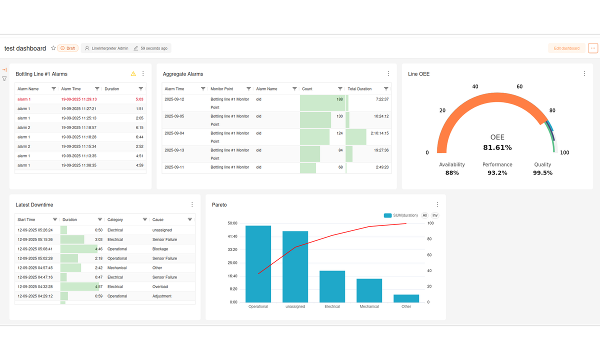
Line Interpreter charts
Charts
Line Interpreter comes with a rich set of customisable charts for displaying plant data. Here are some of the charts available and how they can be used.
State Chart
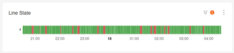
The state chart is designed to give a quick overview of the current shifts production. On the X axis is the shift time, the chart is displayed as a bar that is colour coded by the state of the line. For example, the bar may be green when the line is producing, red when the line is down and grey when the line is unscheduled. This chart is useful because it gives a quick overview of when downtime events occurred, roughly how much time the line was down for, and the overall performance of the line during the shift.
OEE Gauge
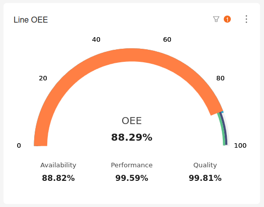
The OEE gauge is a simple chart that shows the OEE of a line as well as the availability, performance and quality. This chart is useful to see how performance is tracking at a glance and can be used in a multi-line dashboard to quickly understand the performance of an entire plant or group of plants.
Downtime Table
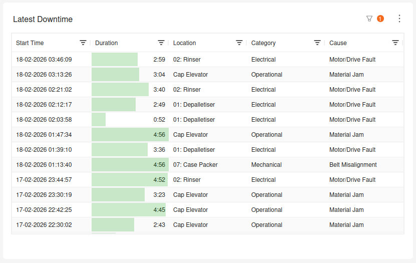
The downtime table lists downtime events and can be configured to display the downtime start time, duration, cause, location and more. Downtime tables can be used in multiple ways. Downtime can be aggregated by category, cause or location, which makes it a useful tool to dive into particular plant areas or types of downtime.
The downtime table can also show individual downtime events per row, which can be useful to quickly see the most recent downtime events, or the longest downtime events during a shift.
Pareto Chart

The pareto chart consists of two parts. The first is a bar chart showing downtime categorised by location, cause category or cause. The bars are ordered by duration. The second component is a cumulative sum of the bars, expressed as a percentage.
Organisations use pareto charts to understand the most significant causes of downtime. By looking at the cumulative percentage line, it's easy to see which categories of downtime are contributing the most to overall downtime. For example, if the cumulative percentage line shows that 80% of downtime is caused by 20% of the causes, then addressing those causes should be the most effective way to reduce overall downtime.

Alex Visser, PhD
Founder & Software Engineer
With over a decade of experience in industrial manufacturing, Dr. Alex Visser is a multidisciplinary engineer specializing in the intersection of software and automation. He is the creator of LineInterpreter, a platform for real-time production monitoring and analytics.